Here is what The Telegraph editors have selected as the best of planetary data visualization:
http://www.telegraph.co.uk/science/picture-galleries/9206887/Artistic-planetary-maps-colourful-images-of-our-solar-system.html?frame=2194610
Wednesday, September 11, 2013
Friday, January 25, 2013
Archean geology

Map of the Lac Peters mapsheet (SE Douglas Harbour), showing the trend of foliations defined from field observations and interpretation of air photographs. Plotted strike and dips are averaged values for each sub-area. Supracrustal belts also define a similar, swirly pattern, whereas late- to post-kinematic monzonitic intrusions strike N-S. Bédard et al.: Archaean cratonization and deformation in the northern Superior Province, Canada: an evaluation of plate tectonic versus vertical tectonic models. Precambrian Research 127 (2003) 61–87
Tuesday, July 10, 2012
Evolution of Apollo 11 landing site map designs

10.12 from the Lunar Sourcebook by G.H. Heiken, D.T. Vaniman, and B.M. French, editors,
copyright 1991 by Cambridge University Press, and is reproduced with
permission. It is dervied from the 1978
air-brush map of the Defence Mapping Agency and
the US Geological Survey.


Landing site map visualization: SIMPLE AND EFFECTIVE. Diagram based on the Apollo 11, 12, and 14 Traverses map prepared by the U.S. Geological Survey and published by the Defense Mapping Agency for NASA.
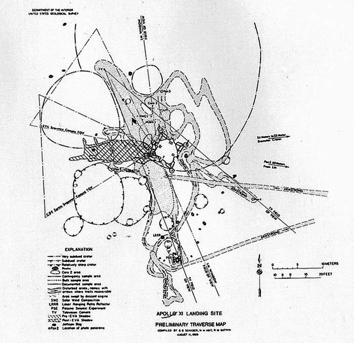

Same as above, with more annotation. Traverse Map, Figure 3-16 from the Apollo 11 Preliminary Science Report


Now this is art. At the suggestion of Joe O’Dea, Thomas Schwagmeier has created an overlay of his Apollo 11 traverse diagram on a football (soccer) pitch. Spatially correct, not less complicated and still visually effective (but not very scientific). Size context is given, Lunar context is lost, however. So this may be more art than science. Designed for international audience.

Oops... Americans don't know how large a football field is... so there is a need for a localized version for the American audience. The same problem arises when spacecraft images are compared to coutry/state contours.

So, nothing is good for me, but from these figures, a good one could be combined.
Source: http://history.nasa.gov/alsj/a11
The Green Moon
NASA/GSFC/MIT/SVS map of the Moon, based on Lunar Reconnaissance Orbiter data. The map has been made at NASA Goddard Scientific Visualization Studio. This is the first time that yellowish green is used to represent the mare elevations; this gives a much warmer appearance than previously used light blue.


This one below has pale blues to green for mare; also warm, but closer to traditional colors and maria have a better contrast.

"The height of the terrain is color-coded, with blues and greens representing low altitudes and reds representing high altitude" (2010)
Animator:Ernie Wright (UMBC) (Lead) Marte Newcombe (GST)


This one below has pale blues to green for mare; also warm, but closer to traditional colors and maria have a better contrast.
Animator:Ernie Wright (UMBC) (Lead) Marte Newcombe (GST)
Producer:Andrew Freeberg (NASA/GSFC)
Scientist:John Keller (NASA/GSFC), James Garvin (NASA/GSFC)
Solar System: Age of Discovery
 This superbe figure (below) is from the Атлас планет земной группы и их спутников (Atlas of Terrestrial planets and their Moon) published in 1992 and produced during the previous 10 years at MIIGAiK, Moscow. This page shows the Soviet discoveries.
Sunday, July 8, 2012
Meteor showers of Earth, Mars and Venus

Brigh colors are daytime showers, dark ones are nighttime showers; small dots represent slower meteors that are presumed to be less bright, larger dots show speedy meteoroids.
Courtesy Apostolis Christou (Armagh Observatory).
Source: A. Christou: Meteoroid streams in the Martian System. in: The meteoroid flux in the Martian Satellite System. MIIGAiK MExLab, July 5-6, 2012.
Thursday, June 21, 2012

Subscribe to:
Posts (Atom)